Our judge Andy Chopping reflects on the 2017 shortlist and offers some tips for this year’s contestants.
September is upon us, heralding the start of the Wiki Loves Monuments photography competition. And I’m delighted to have been asked once again to help judge this excellent competition, which last year saw a remarkable 14,000 entries from across the UK.
I thought that this year’s entrants might benefit from some constructive ideas based on the 200 shortlisted photographs that we were asked to judge last year and why the 10 finalists succeeded in capturing a judge’s eye.
So, what makes a great Wiki Loves Monuments photo?
In no particular order I’d suggest that subject, viewpoint, composition, lighting and focus are all key elements.
Subject
Well, monuments obviously. But consider the vast number of visitors who have photographed England’s well-known castles, cathedrals and stately homes. You can be fairly certain that we will receive hundreds of thoroughly competent images rehashing the same old subjects. Might your efforts be better used in photographing something less mainstream? Given my interest in archaeology I was surprised to find that of last years 200 shortlisted images only 3 captured the monuments which were built by our early pre-Roman ancestors. And equally delighted that this one made the top ten:
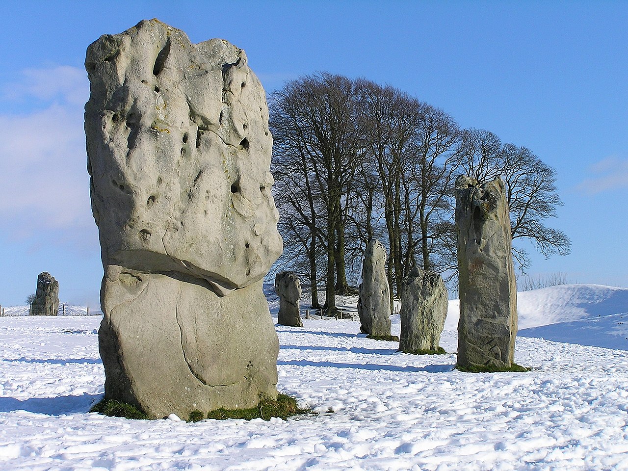
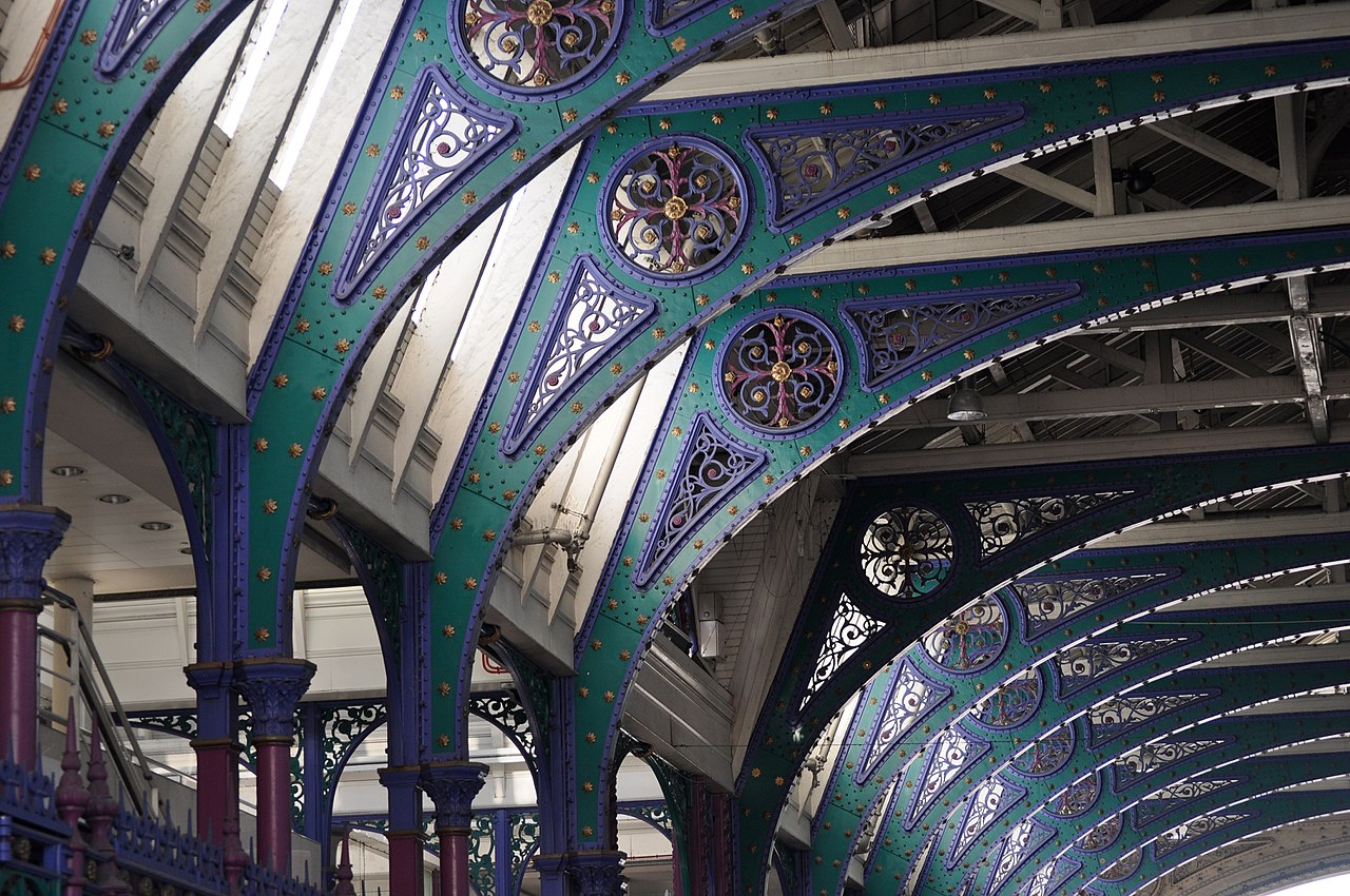
Last year’s shortlist also surprised me with its paucity of photographs showing building interiors. Less than 15% of the entrants attempted to cover this area, and only one made the final cut. So the key to finding something new, and possibly success in the 2018 competition, might be as simple as moving indoors!
Viewpoint
Try to avoid the classic ‘postcard views’; no matter how perfect your image might be it will struggle to make an impression if it’s one of several dozen almost identical photographs. A great many of our monuments are so well known and so heavily photographed that even if we haven’t been to, say, Salisbury Cathedral/the Clifton Suspension Bridge/Stonehenge we will already be so familiar with the monument that we already know the viewpoints that by public consensus are reckoned to be the best.
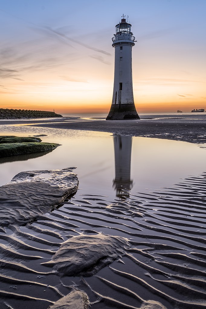
And this is where the challenge lies. Walk around the monument, look at it through fresh eyes and find a viewpoint that avoids the ordinary and illustrates the monument in a way that others will not find so familiar, and will ideally never have experienced. Last year’s entries included a number of photographs made by photographers who had certainly found new viewpoints, working with UAV or ‘Drone’ camera platforms. Sadly none of these aerial images made the final cut. This year might be different. I know from my professional life that, used well (and legally), this technology can be a tremendous asset, but it’s essential to remember that it’s not enough to have an unusual viewpoint. Composition and lighting are also key to success.
Composition
Once you’ve selected the viewpoint for your photograph you’ll start the process of composing the image, finding the ideal way to frame the subject. The use of a tripod will help enormously, not simply by providing a stable base but more importantly by slowing down your actions and giving you time to consider fine adjustments.
Be aware of the classic guidelines of composition: rule of thirds, leading lines, and use of symmetry. But also keep enough background in the image to convey a sense of space and set the monument in context. Not only will the additional space give greater presence to the subject, it will also make the image more ‘useable’ and potentially more successful than the same view and moment tightly cropped.
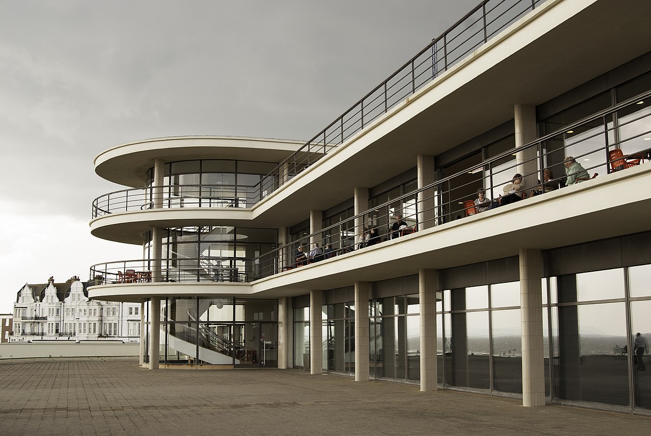
Consider the use of human scale in your images. Less than 10% of last year’s shortlisted submissions featured people and in only 2 of those did their inclusion appear to have been deliberate. It’s undoubtedly true that a bus full of tourists can ruin an image, but one or two well-placed people can provide an added focal point for your shot, introduce a sense of scale and create a more engaging image overall.
Lighting
Lighting is almost everything in an image. Walk around your subject and predict how it might look at different times of the day or night. Consider the movement of daylight across your subject and try to plan the ideal hour to make your photograph.
Try to avoid harsh midday sun and exploit the golden hour. Light in the morning and early evening is much better suited to photography – long shadows accentuate texture and detail and the light has a colour and quality that can lift atmospheric quality.
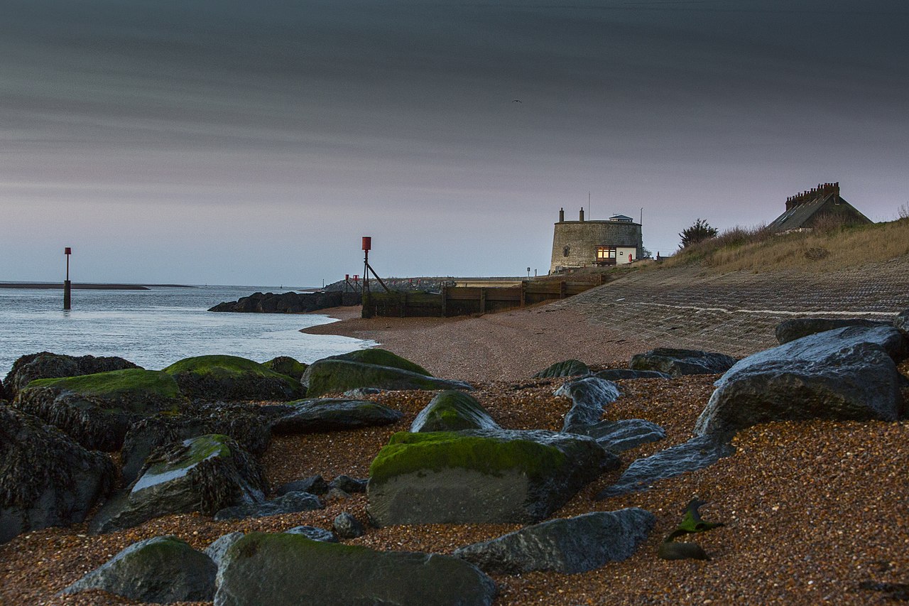
But that being said, don’t be afraid of bad weather. People do their best to avoid wind, rain, sleet and snow. And as a result there’s a lack of photos of monuments in these conditions which immediately sets such images apart from the rest. The 2017 shortlist had only 4 images made in poor weather and 2 of them made it into the final 10.
Spectacular, or subtle and atmospheric lighting is sometimes encountered by accident, but more often by planning and effort. British weather is fickle and many attempts might be required before you find perfect moment to make your photograph.
Focus
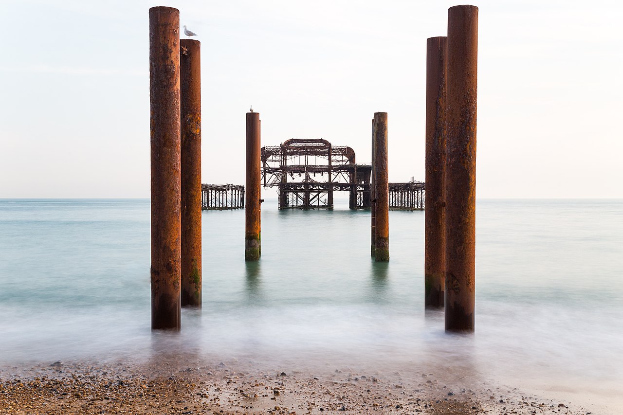
If your camera allows it use selective focus to draw the observer’s eye into the frame, don’t simply let the camera determine what’s important. Selective depth of field can concentrate the observer’s attention where you want it, and can throw unwanted visual clutter into a soft un-distracting fore- or background. If appropriate, consider the use of long exposure to add a sense of movement to your image. Trees, clouds, flags, running water all lend themselves to this technique – but make your intentions apparent, there’s a world of difference between the apparently clumsy slight blurriness of water on the seashore and the mercurial silk like quality of a waves captured by a tripod-mounted long exposure.
Finally …
If possible work with a tripod-mounted camera. Work slowly and make fewer, better images.
Try to see ‘the whole picture’. Many potentially great images don’t make the cut because they were ruined by a fleeting cloud shadow, or an unintended passer-by.
Shoot raw if possible and certainly use the tools available in your preferred processing program. But don’t overdo it; use your skills to finesse a good image, not to rescue a poor one.
Be critical of your own work; avoid at all costs submitting several slightly different versions of the same image; you might leave one stand-out image swamped by your apparent lack of confidence.
Your image should evoke an emotional response which demands more than a cursory glance. It should require a little work from the observer, drawing them into the frame, into a captured moment and place.
Ask yourself if your selected image will stand up to the ‘calendar test’… imagine it on your wall or desk for an entire month. When it’s time to turn the page a great photo still engages and entertains – will yours?